The three-in-one business structure made perfectly good sense to Valerie Clark.
The problem: It wasn’t always so clear to clients.
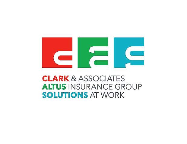
So after a months-long process of talking, creating and talking some more, the three separate Reno companies that operate under one roof — Clark & Associates, Altus Insurance Group and Solutions At Work — have launched a new graphic look that ties it all together.
Clark & Associates, established in 1992 by Clark, a former nurse, is an independent insurance agency that specializes in employee benefits. It’s owned by Clark and Brandy Allazetta.
As they worked with businesses on their benefits needs, Clark & Associates staff routinely fielded questions about human resources issues from their clients — questions that an insurance company isn’t prepared to answer.
So in 2010, Clark teamed with HR specialists Sarah Sommers, Dawn Hamm, Diana Albiniano and Jill Alger to launch Solutions at Work, a payroll and consulting company. Clark is a minority owner in the firm, which shares office space with Clark & Associates.
A year later, eying an opportunity to build a new property and casualty insurance company from the ground up, Clark joined forces with Audrey Damonte to launch Altus Insurance Group.
Clark, the majority owner of Altus Insurance Group, figured that clients often needed property and casualty insurance just as much as they needed health benefits, and a sales call for one product line was likely to open the door for the other.
By the time this year dawned, three companies with different ownership structures were working under one roof in South Meadows — Clark Insurance Solutions, Altus Insurance Group and Solutions at Work — and each of them had its own brand identity and logo. Sometimes they work separately; sometimes various combinations of the three companies work together with clients.
Executives of the three companies agreed to bring in Tim O’Brien Creative of Reno, a firm headed by a former creative director of R&R Partners.
“They had three perfectly good logos for the three entities, but there was no commonality,” says O’Brien, who specializes in helping business owners figure out what their brands are all about.
And while the relationships between the three companies were sometimes complicated, O’Brien listened for ways to make the branding as simple as possible.
“They don’t see themselves as just insurance companies or just HR professionals,” he says. “They see that they solve problems.”
And with that, O’Brien sat down with Travis Bennett, a graphic designer in Reno. They started drawing, then redrawing the words in the names of the three companies.
Simplifying, they settled on single, slightly truncated lower-case letters — C, S and A — to represent each of the three companies in a new logo design. Instead of an individual look, each of the three brand identities are based on typography that’s identical to the other two.
But the three brands each are based on a distinctive color — red for Clark & Associates, green for Altus and teal for Solutions at Work.
The new branding rolled out this summer is reflected in print and social media applications. A new Web item in the works, Clark says.

Comments
Use the comment form below to begin a discussion about this content.
Sign in to comment